The Brief
To rebrand one of the UK's fastest growing gin brands.
The Detail
Whitley Neill has grown to become a key player in the UK gin market now boasting over 11 different flavours within its gin portfolio. They therefore needed to reposition their brand to stand out in this congested market whilst showcasing their colourful range of unique flavours.
The Work
The challenge from the outset was how to highlight the global inspiration behind the different flavours as well as the striking colours of the bottles in a way that felt unified.
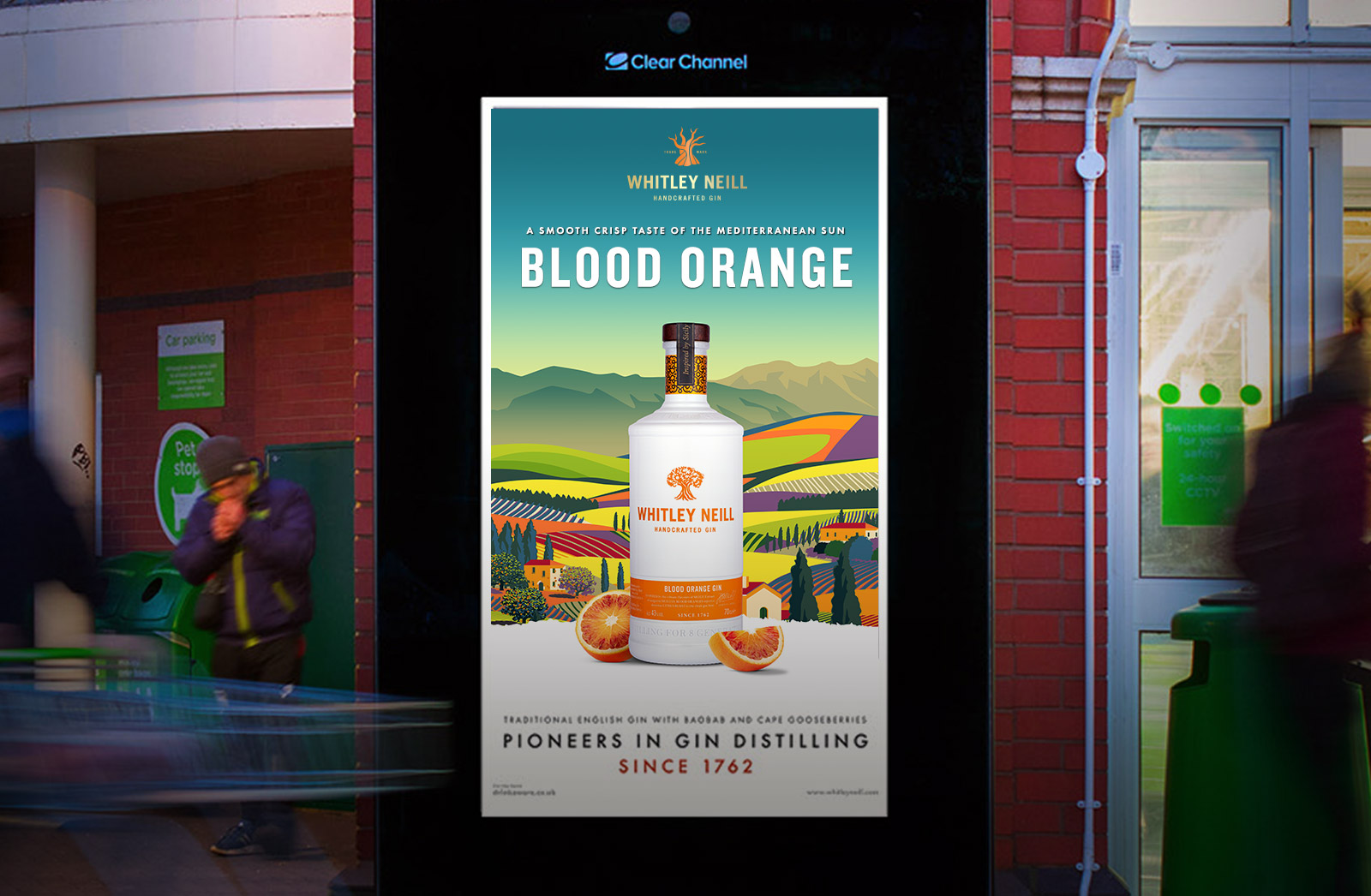
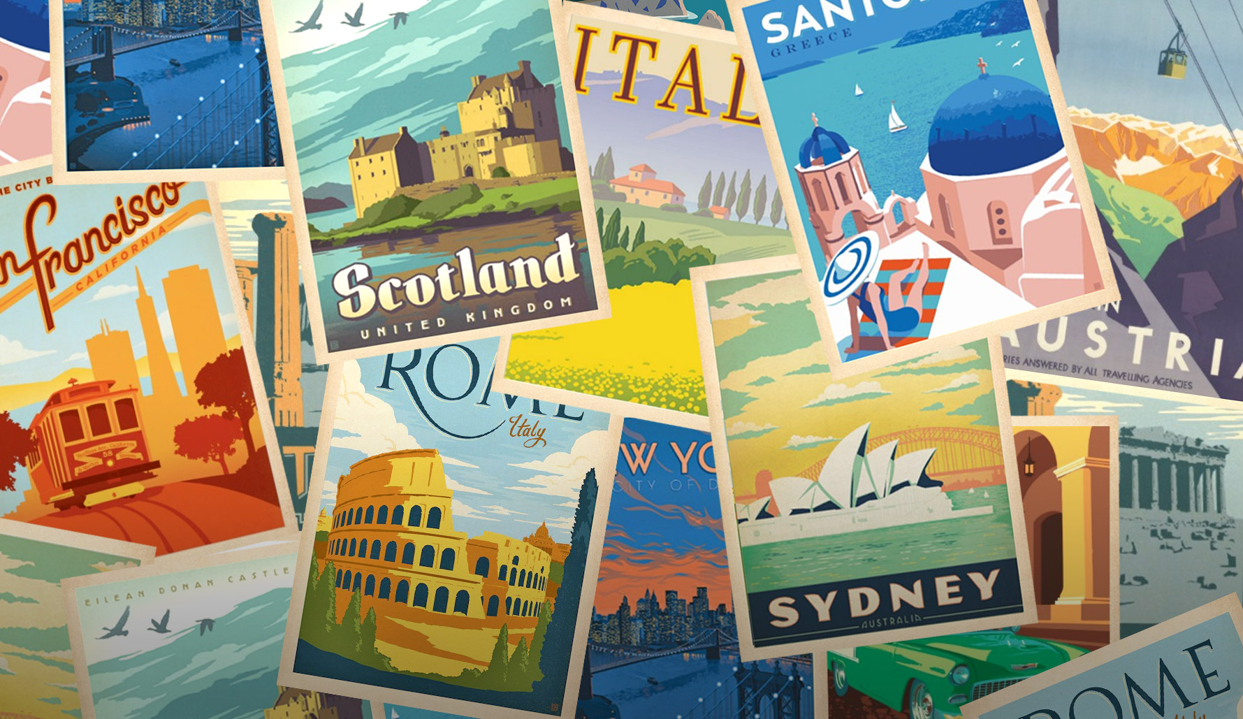
The final creative was inspired by the vibrant and colourful postcards of the 1950s and 60s as they felt like the perfect way to showcase the countries that inspired each of the flavours.
The final designs featured stylised landscapes that provided backdrops to each of the bottles that worked both independently and also when featuring the entire range.
What we did
Branding, creative strategy, print design, packaging design, motion graphics.
Creative Inspiration
1950s and 60s travel postcards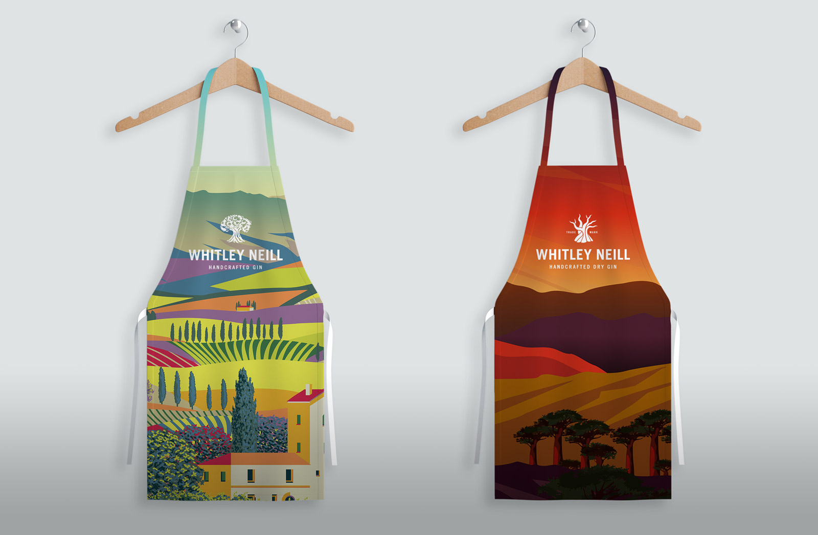
Staff Aprons
Events team apparel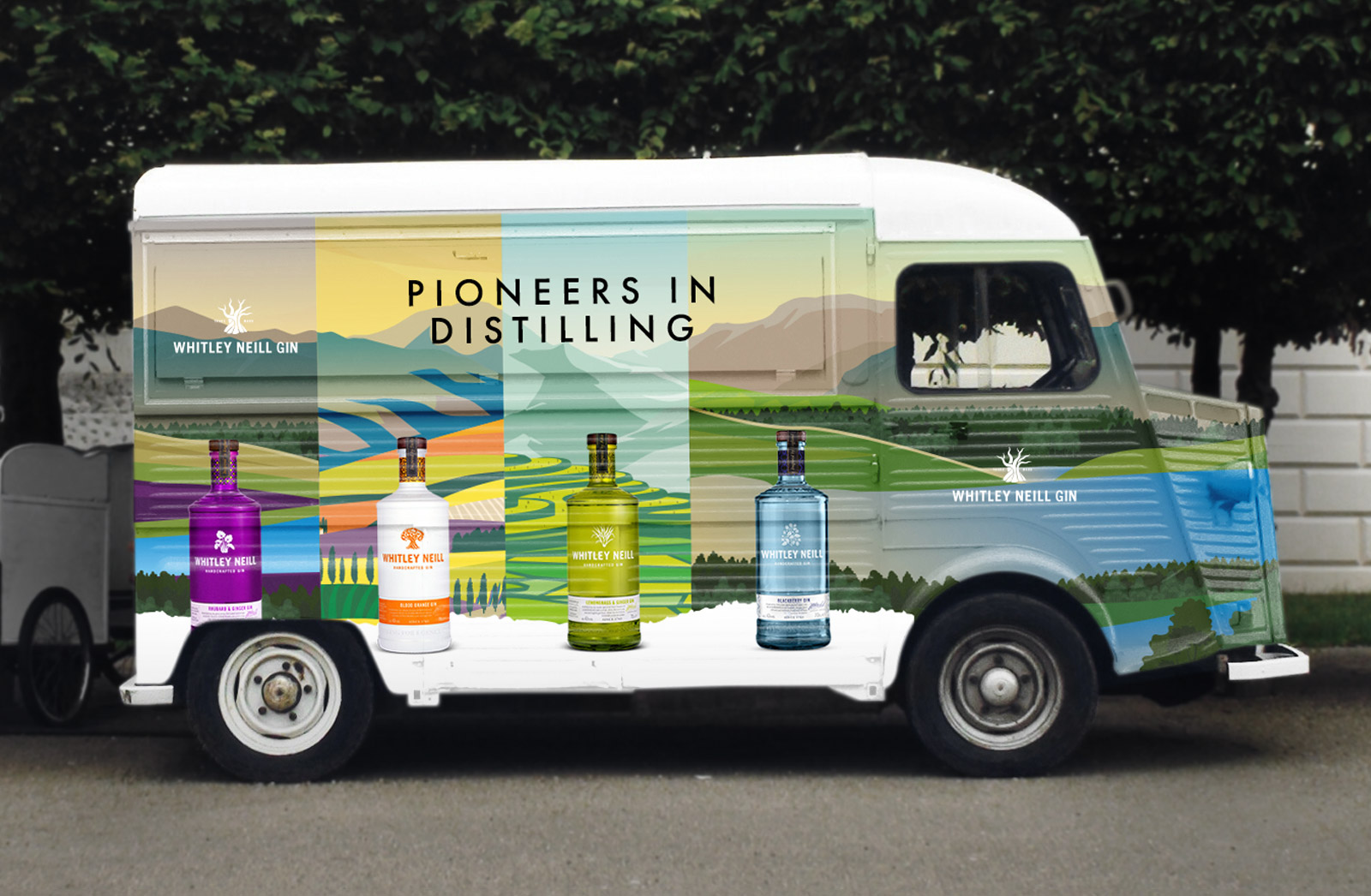
Outdoor Events
Branded Vintage Truck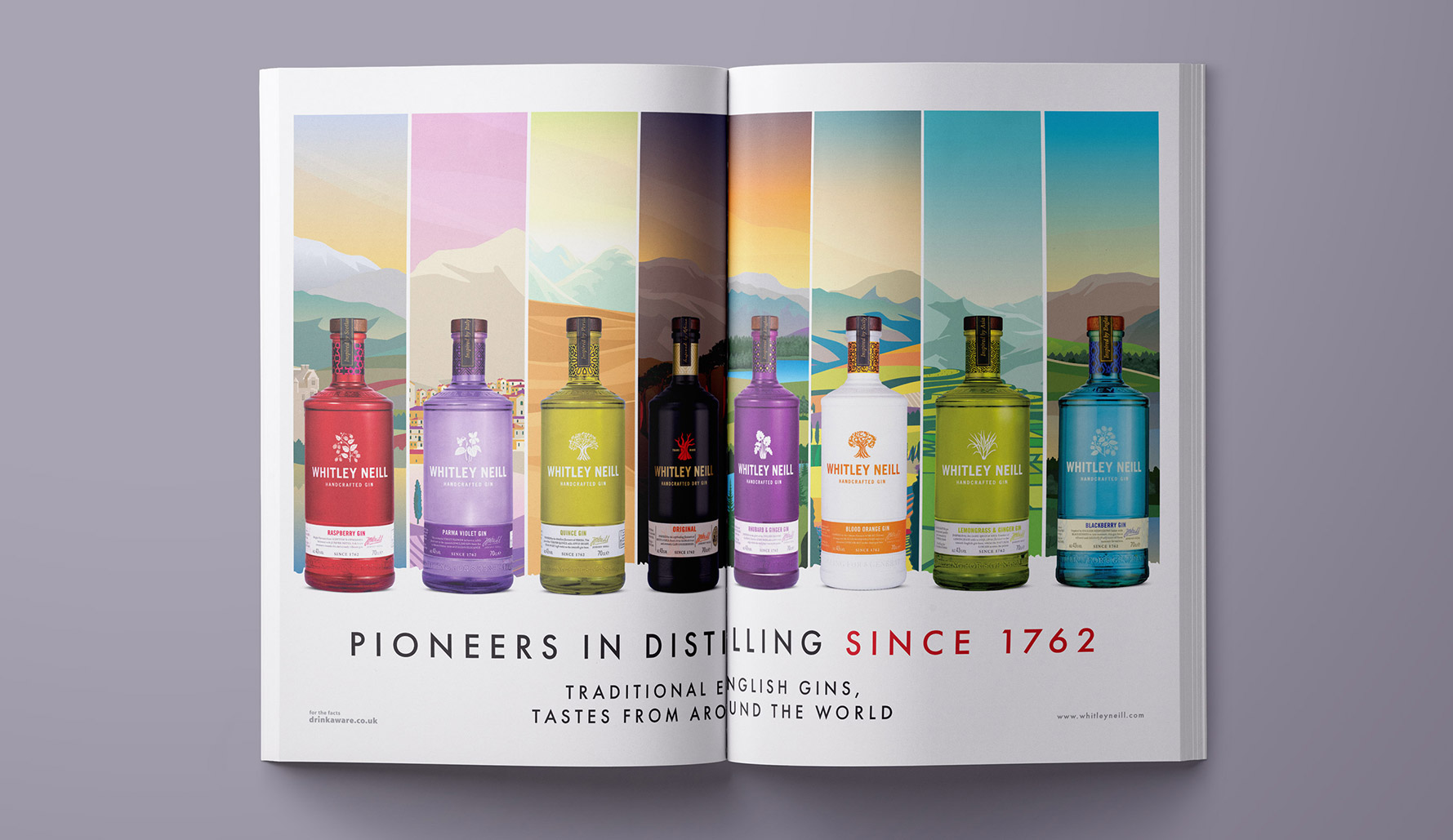
Print Ad
Double page spread print ad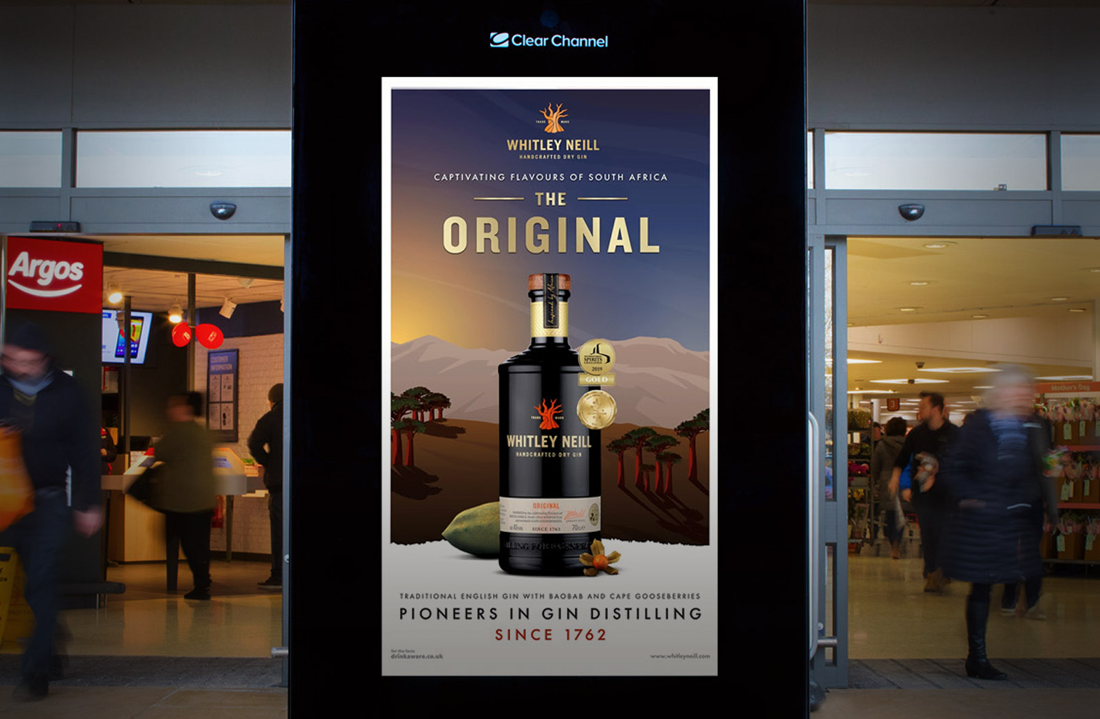
6 Sheet Ad
Featured across Sainsbury's stores